Select Language:
Every year, tech enthusiasts remark that new iPhones closely resemble their predecessors, and while there’s a kernel of truth in this observation, it might not paint the whole picture.
Bloomberg’s Mark Gurman even suggested in his latest newsletter that Apple’s innovation cycle for iPhones is approaching a five-year rhythm, where only every fifth release introduces something genuinely new.
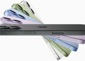
Apple now seems to be following a five-year development cycle. While the iPhone 16 retains a design strikingly similar to the iPhone 12, various features have been added from 2020 to 2024. However, it’s clear that the era of frequent and significant hardware changes has come to an end.
I wouldn’t go that far myself. True, the visual design of the iPhone remains relatively constant, but this is somewhat expected. After achieving an all-screen look, any new iPhone will naturally resemble its predecessors. This trend applies not only to Apple but to all high-end smartphones.
As Steve Jobs famously articulated, design encompasses not just the appearance of a product, but also how it functions. My initial experience with the iPhone 16 Pro Max indicates that the camera functionality this year represents a notable step forward compared to last year’s version.

A Lot Looks the Same
Indeed, when placing the iPhone 15 Pro Max next to the iPhone 16 Pro Max, it’s clear that the visual differences are minimal.
The slight change in screen dimensions is noticeable, though hardly earth-shattering. Likewise, the thinner edges of the newer model don’t significantly alter the overall aesthetic.
Initial comparison photos I’ve snapped so far don’t seem dramatically different at first glance. However, I plan to conduct more structured comparisons soon with a tripod for better results.
Innovative Camera Control Button
Feedback from attendees of the launch revealed that the new Camera Control button requires some adjustment, and I can certainly attest to that.
I struggled to differentiate the pressure needed for a half-press (which brings up the interface) versus a full press (which snaps a photo). Moreover, the double-press action for switching modes felt a bit finicky, leading to occasional accidental shots.
Enhancing Button Functionality
To streamline my experience, I adjusted the accessibility settings. First, I lowered the pressure required for a light press to make it clearer from a full press. Additionally, I set the double-press function to respond more slowly.

These adjustments have significantly improved my experience.
UI Needs Time to Adjust
However, there’s still a learning curve with the UI. A light press initially shows the last setting you modified. For example, if exposure compensation was altered last, that’s what you’ll see right away.

Switching to a different control requires a light double-press to return to the settings menu, swiping to your desired option, and then light-pressing to access those settings before finalizing your selection.
This process may seem cumbersome initially, but it becomes intuitive with practice. If I can adapt to the Sony camera interface, I’m confident this will quickly feel natural as well.
Zoom Functionality
Zooming offers two methods. You can choose the Zoom icon for free-range sliding, or opt for the Camera icon to switch between 0.5x, 1x, 2x, and 5x lenses.
Personally, I favor using optical zoom whenever viable, so I prefer the Camera settings for this.
Still, I noticed a peculiar feature: despite Apple advising developers to avoid duplication of functionalities between the slider and on-screen controls, the Camera app still shows the camera picker on-screen, as seen below:

I’m assuming this is an oversight that will be rectified in future updates (currently on iOS 18.1 beta 4).
A Significant Improvement Already
Even with limited usage so far, I’m impressed.
Being able to maintain my finger on the shutter button while adjusting settings creates a vastly superior experience compared to removing my finger to interact with on-screen menus. This is particularly beneficial for exposure adjustments, as changing your framing can alter the settings needed.
Previously, I believed this button would prove more impactful than it seemed, and my early experiences strongly support that sentiment.
Taking Comparison Photos Will Take Time
Unfortunately, the current London weather isn’t ideal for photography, and the forecast for the upcoming week isn’t promising either:

It’s uncertain when I’ll manage to capture quality comparison shots. However, as soon as the sun shines, I’ll venture out with a tripod to take identical shots with both devices to determine the differences.
I’m also eager to experiment with Photographic Styles. Typically, I prefer manual adjustments over filters, yet many reviewers have praised these styles, so I’m willing to give them a shot.
Additionally, I plan to use the zoom slider for video recordings, which isn’t something I usually do, but can be handy for specific scenarios, such as capturing dance performances where the dancers move from one end of the stage to the other.
As more experiences unfold, I’ll share my findings, but for now, it seems that the Camera Control button is the standout feature for this upgrade.
Image: Apple


