Select Language:
Appreciating the Difference: True Country Sizes versus Mercator Projections
1. The Commonly Viewed Map: The Illusion of Size with Light Blue Countries
Most world maps we see daily, whether in classrooms, textbooks, or online, display countries in a way that slightly distorts their actual size. When looking at these maps, the size of each country is based on the Mercator projection—a type of map projection that preserves shape and direction but significantly alters the size of landmasses, especially near the poles. These countries, shown in light blue, tend to appear larger or smaller than they truly are, creating misconceptions about their actual scale.
2. The Reality Check: True Country Sizes Unveiled in Dark Blue
Contrasting the maps, the dark blue regions depict the actual size of countries as they would appear on a globe. This more accurate representation shows how land areas compare without the distortions introduced by flat projections. For instance, Greenland appears massive in Mercator maps but is actually much smaller relative to continents like Africa, which appears prominently but often seems smaller due to map distortions.
3. Why the Mercator Map Still Dominates
Developed in 1569, the Mercator projection was a breakthrough for navigation, enabling sailors to plot straight-line courses across the oceans. Its usefulness for navigation has led to its widespread use in education and media. However, this projection distorts landmass size, giving Europe and North America an appearance of being far larger than their actual size relative to Africa, South America, or Australia. Understanding its purpose helps explain why it remains in use despite its flaws.
4. The Distortion Effect: Overestimating and Underestimating Countries
The Mercator projection tends to exaggerate the size of countries near the poles and diminish those near the equator. For example:
- Greenland, often depicted as roughly the size of Africa in Mercator maps, is actually about 7% the size of Africa.
- Canada and Russia appear enormous in Mercator maps, but their actual landmass distribution is more balanced when viewed through true size comparisons.
These distortions influence our perception of global importance, power, or economic influence, which can lead to misconceptions about global geography and inequality.
5. Why Accurate Size Matters
Understanding the real sizes of countries can impact global perspectives:
- Education: Helps students develop a more accurate worldview.
- Politics: Correctly size representations can influence perceptions of regional importance.
- Cultural Understanding: Correct map sizes foster respect for less-prominent nations, often misrepresented in standard maps.
- Environmental Awareness: Recognizing the true size of landmasses emphasizes their ecological significance, such as the vastness of the Amazon basin or the African continent.
6. Alternative Map Projections that Show True Sizes
To address the distortion of the Mercator projection, cartographers employ alternative projections like:
- Gall-Peters Projection: Focuses on accurate landmass sizes, maintaining equal area.
- Robinson and Winkel Tripel Projections: Strive for a balance between shape, size, and visual appeal, offering less distorted representations.
- The Goode’s Homolosine Projection: Shows landmasses with minimal distortion, especially for continent size comparisons.
Using these projections helps depict a more accurate global perspective, emphasizing the true diversity and scale of Earth’s landmasses.
7. Visual Example: The Global Size Discrepancy
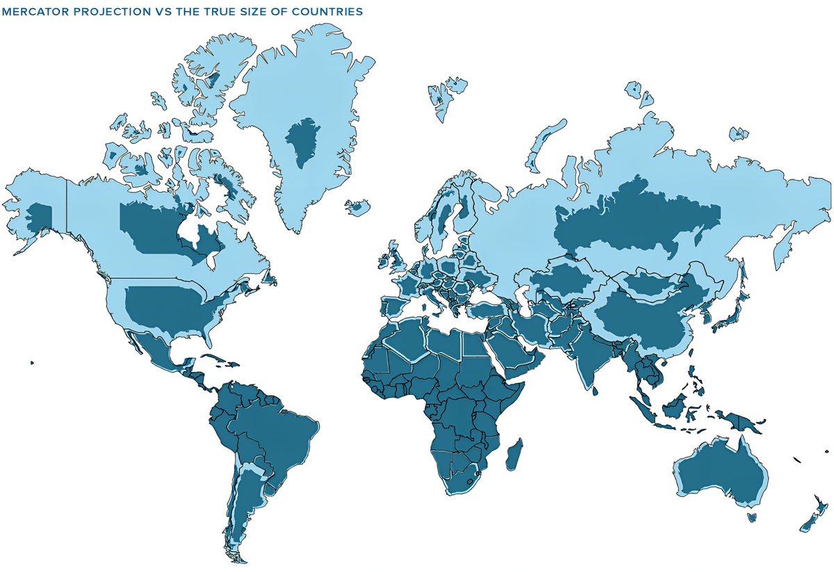
This image starkly illustrates how we perceive the world:
- The light blue countries showcase the traditional Mercator view, where regions like Greenland or North America appear exaggerated.
- The dark blue regions reveal the real sizes, demonstrating just how much the Mercator projection can skew our understanding of Earth’s geography.
8. The Impact of Misunderstanding Map Distortions
Recognizing distortions influences how we interpret news, international relations, and cultural narratives. When maps emphasize certain regions over others purely based on size distortions, it can subtly reinforce stereotypes or misconceptions. An informed perspective encourages more equitable views of global diversity and helps promote accurate educational practices.
9. Moving Toward More Truthful Map Representations
Educators, governments, and mapmakers are increasingly advocating for maps that portray Earth’s geography more accurately:
- Including multiple projections in classrooms.
- Using digital tools that can toggle between different map views.
- Promoting awareness of how map projections influence perceptions.
Such efforts aim to build a more informed and fair understanding of the world’s geography.
10. Final Reflection: Embracing a Globe’s Perspective
Maps are tools for understanding our world, but no single map can perfectly capture every detail. Recognizing the differences between Mercator projections and true landmass sizes helps us see beyond distortions and appreciate Earth’s vast diversity. By learning to interpret various map types critically, we gain a richer, more accurate view of our planet and its nations, fostering global awareness and empathy.
Understanding the true size of countries and the distortions caused by traditional map projections deepens our appreciation for the complexity of mapping our world. As we continue to explore and teach geography in 2025, embracing accurate representations remains essential for cultivating informed global citizens.