Select Language:
Understanding the Difference: Mercator Projection vs True Size of Countries
1. The Origin and Purpose of the Mercator Projection
The Mercator projection was created in 1569 by Gerardus Mercator primarily as a navigational tool for sailors. It allows for straight-line plotting of courses, which is crucial for maritime navigation. This map projection maintains accurate angles and directions, making it invaluable for sailors. However, it distorts the size of landmasses, especially near the poles, leading to misconceptions about the true size of various countries.
2. How the Mercator Map Distorts Landmass Sizes
The most common issue with the Mercator projection is its exaggerated portrayal of landmass size at higher latitudes. For example, Greenland appears almost as large as Africa, but in reality, Africa’s landmass is about 14 times larger. This distortion comes from the way the map stretches areas as they near the poles to maintain straight lines for navigation. As a result, countries like Canada, Russia, and parts of Northern Europe look disproportionately large compared to their actual sizes.
3. The True Size of Countries Revealed
By comparing the Mercator projection with equal-area maps, such as the Gall-Peters projection, the true sizes of countries become more evident. For example, Africa is visibly much larger than Greenland, and South America is larger than North America. Equal-area maps aim to faithfully depict landmass sizes without distorting their apparent scale, providing a more realistic perspective of the world.
4. The Impact of Projection Choices on World Perception
Map projections directly influence how we perceive our world. The Mercator map has historically contributed to the Eurocentric view that European nations are larger and more significant. This skewed perspective can affect everything from education to geopolitics. Choosing the right map projection is essential for promoting a more accurate understanding of global relationships.
5. Why the Myth of Oversized Countries Persists
Despite the existence of more accurate projections, the Mercator map remains widely used, especially in classrooms and online platforms. Many people have grown accustomed to its familiar layout, which tends to exaggerate the size of countries near the poles. It creates an impression that Northern Hemisphere nations dominate the world, reinforcing certain stereotypes and misconceptions about global geography.
6. The Modern Use of Different Map Projections
Today, cartographers and educators encourage using various projections depending on the context. For instance, Robinson and Winkel Tripel projections balance shape and size, offering a more holistic view. Educational materials increasingly emphasize understanding the limitations of each projection, fostering critical thinking about map interpretation. Interactive digital maps now allow users to explore countries in true size, combating long-standing misconceptions.
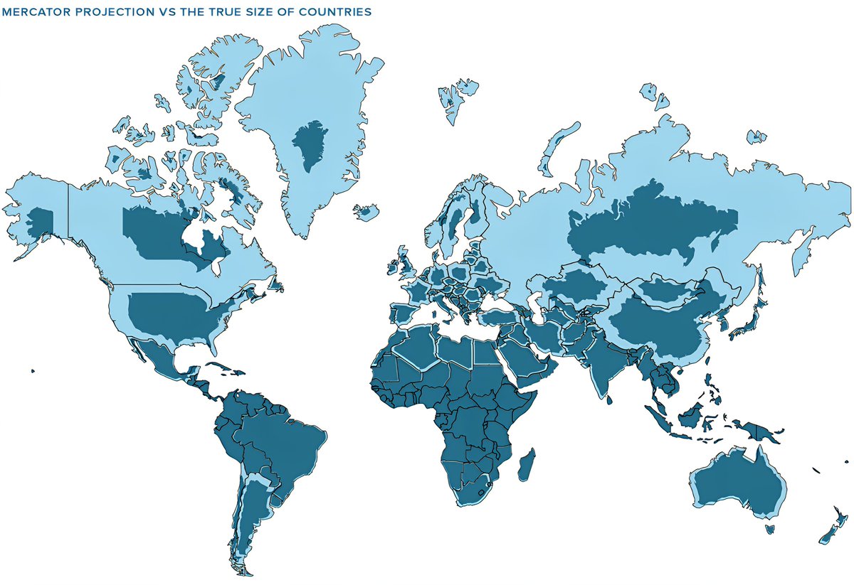
7. Real-World Examples: Visualizing True Sizes
The image below (https://www.digitalphablet.com/wp-content/uploads/2026/02/Mercator-Projection-Compared-to-Actual-Country-Sizes.jpg) vividly illustrates how countries’ sizes change when shifting from the Mercator projection to a true-size perspective. For example, Greenland’s size diminishes significantly, aligning more accurately with its actual landmass compared to the exaggerated Mercator depiction. Such visuals help in understanding the importance of map choice in perceiving our world correctly.
8. The Importance of Education About Map Distortions
Educating the public about the differences between map projections helps combat misconceptions. Teachers and geographers emphasize that no projection is perfect—each involves trade-offs. By recognizing these distortions, students can develop a more nuanced understanding of world geography, appreciating the diversity and scale of nations without the bias introduced by outdated or overly simplistic maps.
9. Moving Towards More Accurate Global Representations
Advancements in cartography, including digital mapping technology and interactive tools, make it easier to present world maps that accurately reflect true sizes. World organizations and educational institutions are increasingly adopting more accurate projections to promote global awareness and understanding. This shift helps demystify geographical misconceptions and fosters a more informed perspective on world affairs.
10. The Continuing Debate Over Map Projections
This ongoing conversation about map distortions underscores how visualization shapes perception. While the Mercator map remains common, recognizing its limitations encourages the use of alternative projections for teaching and analysis. As our technological capabilities grow, so does the potential for more truthful cartographic representations, ultimately promoting a fairer and more accurate understanding of Earth’s geography.